The updated version of Vote for Policies was released last week in preparation for the 2015 General Election. Having tried the previous version only recently I decided to take the new version for a spin. As before the site aims to extract party policies from the personalities and rhetoric of the surrounding campaign and lay them out next to each other so voters can really focus on the issues that matter to them. They claim it helps make “an informed, unbiased decision about who to vote for” for those who might want to vote with their head as much as their heart. It still works by taking you through a survey that presents policies for different issues and inciting you to select your preferred set of policies. At the end the survey presents results of which parties you prefer based on your policy selections.
Taking the Survey

The new site looks great visually. It’s clear and easy to see how to get started. There are ten issues in all of which you need to select at least four to start. Being a geek I selected all ten. The next screen asks you to select your country. This is so the policies can be tailored for your region so the five most relevant parties are used. This means voters in different parts of the country will have slightly different options. This is something the TV debates could perhaps consider? For England the parties are: Conservatives, Green Party, Labour, Liberal Democrats and UKIP.

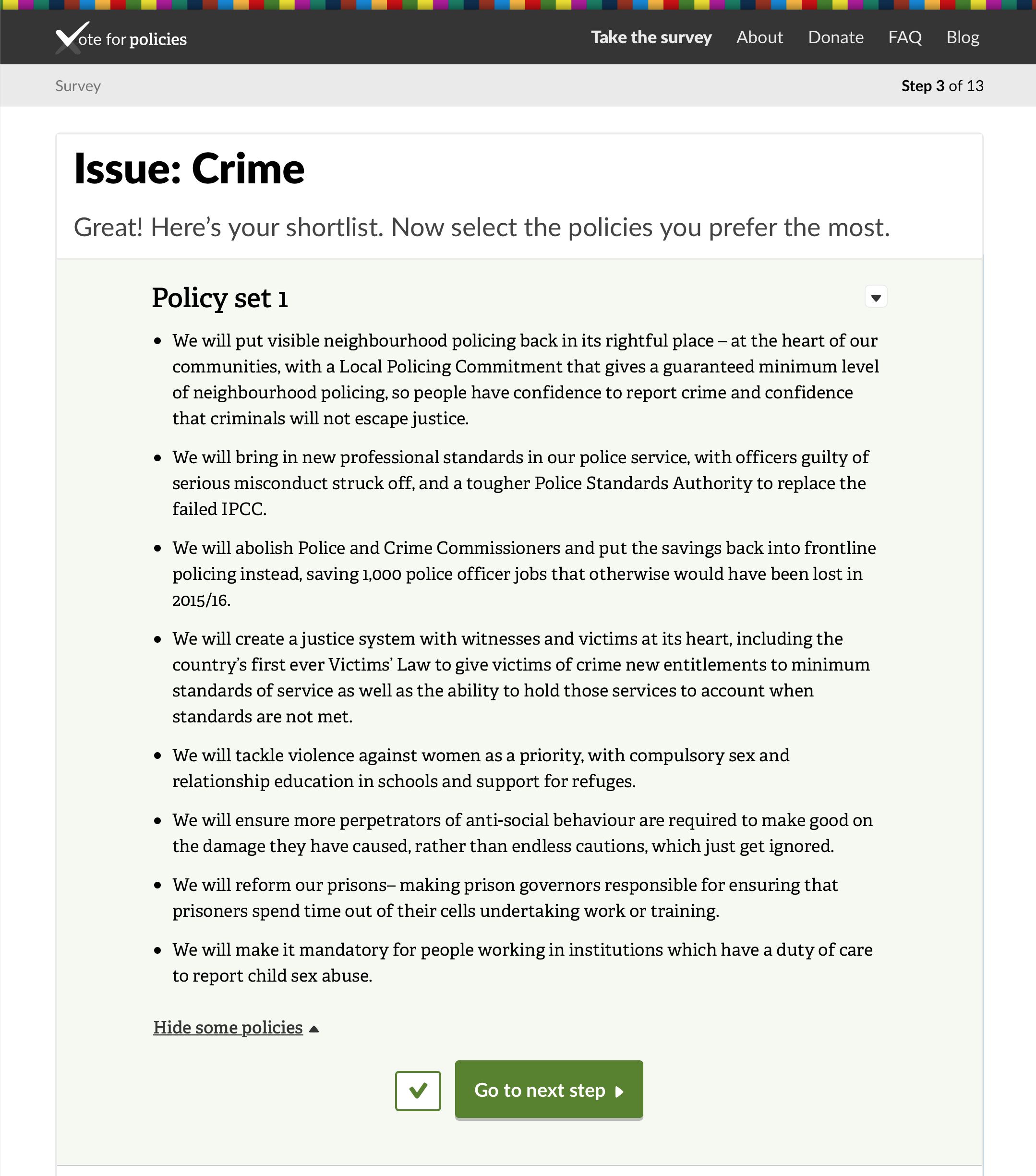
The bulk of the survey is being presented with the policies issues by issues. Up comes the first issue and then 5 policy sets will be presented. An improvement on the previous version is you first shortlist the policies which makes comparison easier. So you review a policy set then are asked to say whether you would consider voting for these policies are not. This quickly helps eliminate policies you are not interested in.
Once you have decided on each of the five policy sets then all the policy sets on the shortlist of those you may consider voting for are presented on a single screen. You can then pay more attention to the policy details and compare them against each other before selecting which policy set you prefer. Having done this the survey moves onto the next issue and repeats for as many issues as you have selected.
This all takes a while, and I’m not sure if you can stop in the middle and come back, but progress through the survey is well signposted.
Reflecting on the Survey Process
I felt this worked well and helped reduce the amount of information at the comparison stage. For me this usually meant quickly eliminating the more right wing policies leaving me with a set of more left learning policies to compare. This isn’t surprising although there were a few areas where I selected four policy sets and one where I shortlisted all five. Some issues are closer to the centre than others it seems. I found it easy to quickly eliminate one or two policy sets from my decision. I found it much harder to select between my shortlisted options. I felt there were many good ideas and policies put forward.
I still felt at times it was still too easy to identify a particular party. As before it is admirable that VfP fillets the policies from the party literature and leaves it untouched but some rhetorical styles and phrases are so distinctive the party appears through the policies limiting the unbiased nature of the exercise. Neutralising the language would make the policies more unbiased. Whilst their is editorial risk in doing so I did feel that it would be possible to ‘clean up’ some of the rhetorical flourishes to make the policy statements more stark whilst avoiding accusations of impartiality.
Smart Policies?
The other thing a focus on policy statements demonstrates is how some are more policy like than others. There is variation between SMART (Specific, Measurable, Agreed, Realistic, Timed) policy statements and vague slogans for some issues that made comparison difficult. Overall, I always erred on the side of the party who offered SMARTer policies rather than vague and slippery aspirations. This is an area where I think Green policy can improve I think and where Labour policy is very good. Still, many people would agree that the Labour Party’s problem is one of style and communication rather than substance; they would easily win an election if more attention was paid to the good work they have done in government and the good work they pledge to do beneath all the canards and red herrings town their way and the shouty froth of political mediation.
Getting the Results
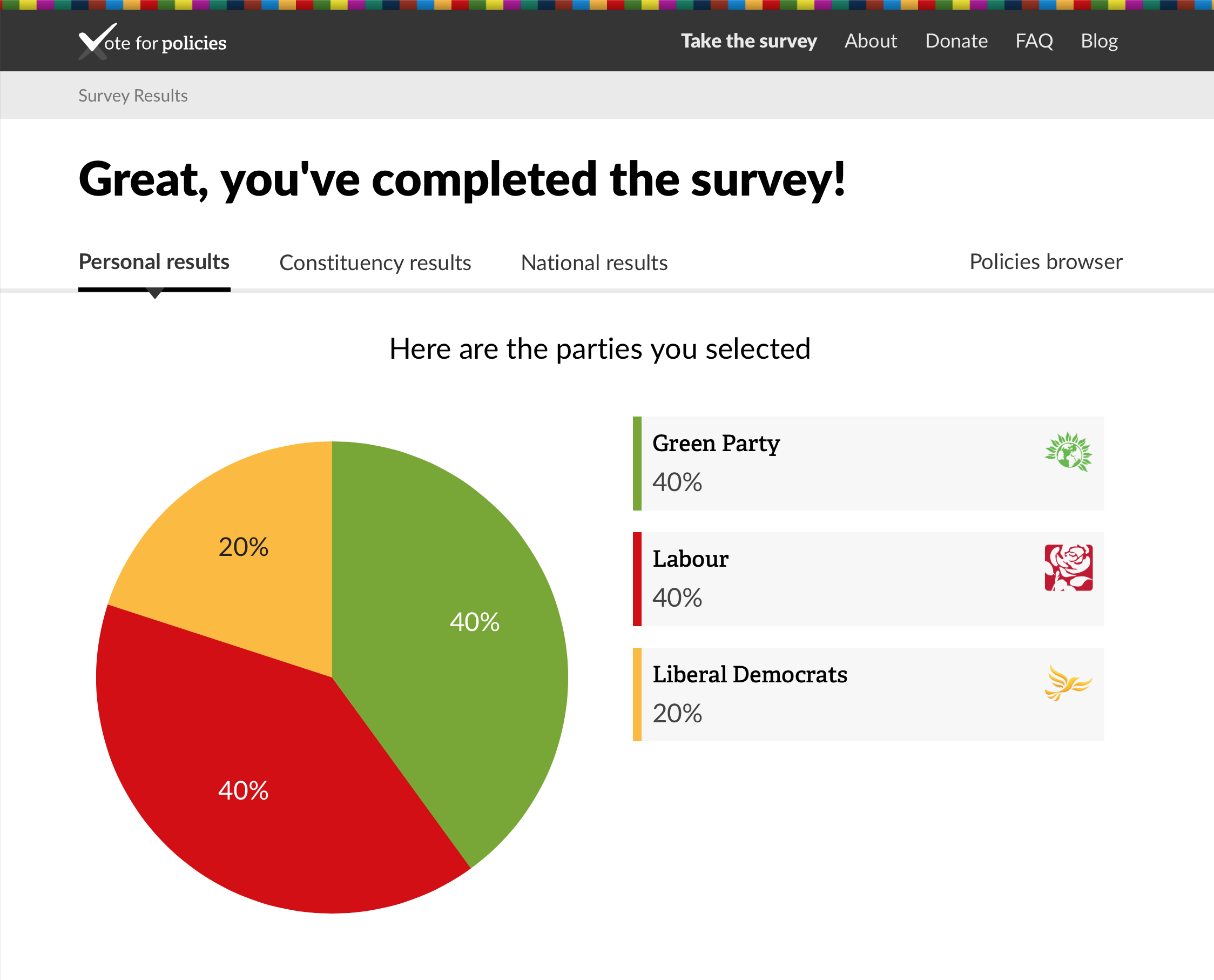
The final stage is to enter your postcode, for constituency comparisons and then the results are presented. This was the first time I’d seen any pie charts and I think it works well that you have to take the survey before getting and idea of how your constituency and national results look as this helps reduce bias.
The results are really well presented. There is a clear pie chart showing your overall breakdown. My result of 40% Green, 40% Labour and 20% Liberal Democrat was pretty much unchanged from my 2010 attempt.
Underneath there is an option to enter an email address so be sent a link to your results and send a reminder on polling day. There are also the usual social media sharing options to spread the word. VfP are hoping for 5 million completed surveys this time around.
In the final section the results are broken down by issue so you can see which party you voted for on which issue. This is where some of my results were a bit surprising. There was evidence of a left leaning consensus in my selections with variation at the level of implementation detail or phrasing rather than aspiration.
Overall, and not surprisingly, I felt the Green Party were better at articulating a social democratic vision whilst Labour in particular was better at translating vaguer ambitions into something that could be implemented and might actually work. There are some sticking points, Trident being an obvious one, but I finished feeling optimistic about the prospects of a leftish coalition and wondering yet again why the Liberal Democrats are members of the current coalition.
In fact, I would probably prefer a left leaning coalition with a broader spectrum of policies than perhaps a majority to better provide a mix of head, heart and soul. Certainly I think the Green surge, and to be fair the emergence of UKIP, is widening the Overton window and that is welcome.
The results are also then shown for my constituency where 61 surveys have currently been completed and nationally where 47,000 have currently been completed. I won’t say much about these results yet to prevent influencing those yet to take the survey but the results are still looking strange. I still have my reservation from my 2010 attempt about the demographic sample of this kind of tool:
An online tool like this appeals only to a minority of voters in certain demographics. There is no demographic breakdown for the constituency or overall responses. Those advocating the tool are likely to be tech-savvy, media literate and used to obtaining their information from diverse sources. Do these really represent the core voters who turn out and decide elections?
Policy Browsing
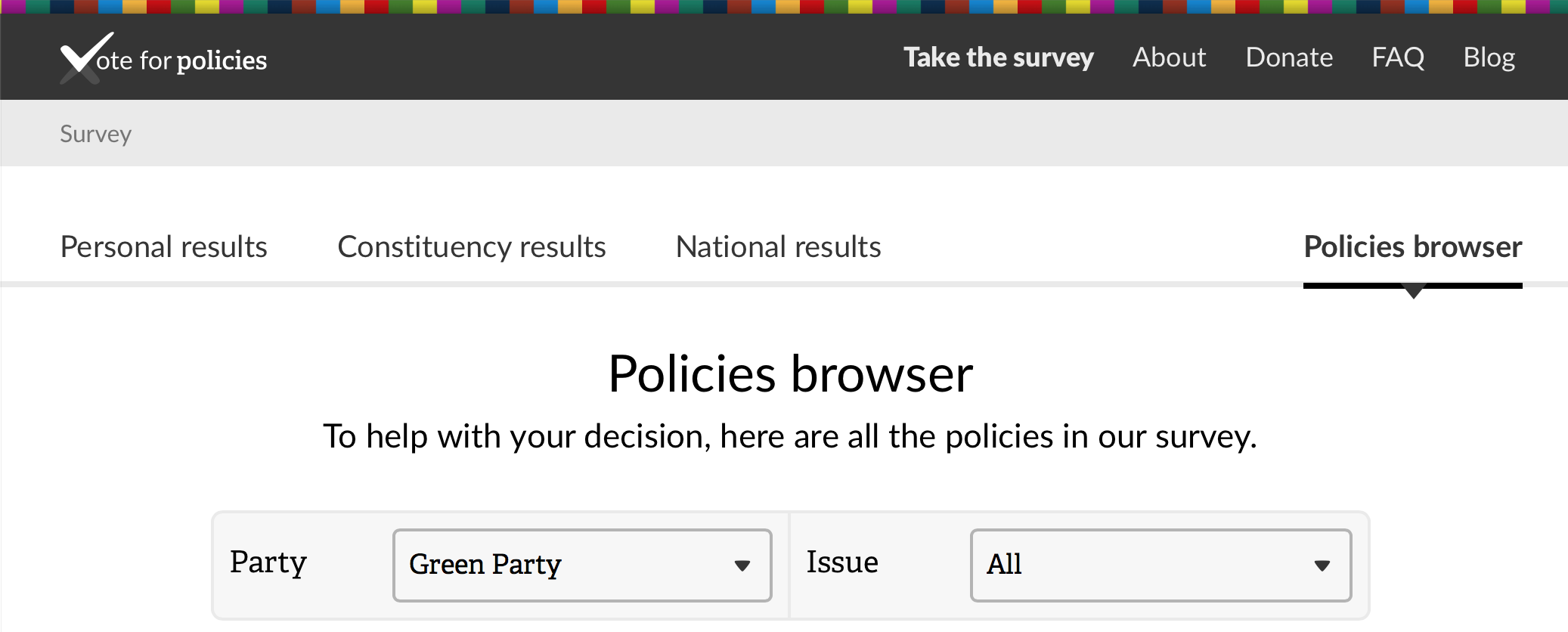
A welcome addition is a policies browser. This allows you to go back and look at all policies again, this time knowing which policies belong to which party. This allows a more reflective look at all the policies for a party or to compare policies by issue. The browser also shows which policies you voted for. There is no login for the site which suggests this information using cookies and local storage to remember your participation. If you attempt to start the survey again then the site prompts that you have already completed and provides a link to your results (the same permalink as used when sharing). However it does also give an option to forget you, suggesting you can erase the memory of your previous attempt and have another go. Not clear if you do this whether your previous result will be erased from constituency and national results or not or whether you could complete multiple attempts all adding to the overall verdict. It is this question that makes me have reservations about using any results as campaign leverage.
Summary
Overall I think the site itself is much improved and I do hope it will be successful in introducing policies and a more thoughtful reflection on their voting preference to as many people as possible. Caveats still remain about its use as evidence.
Pros
- Clear and easy to use
- Like introduction of shortlisting stage to quickly eliminate some policies
- Result presentation much improved
- Addition of the policy browser makes it easy to compare all parties across an issue or see all policies for a party to better review/reconsider after taking the initial survey
- Don’t get to see national and constituency results until taken the survey preventing influence
Cons
- Still possibly open to gaming results so still a better tool for individuals rather than evidence of voting intention.
- Still too easy to identify policies for some parties because of their distinctive language and policies. The editorial/neutrality conundrum is not yet resolved
